The first impression your brand makes will be formed largely by color.
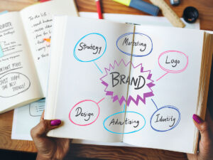
Selecting the right color palette for your logo is one of the most important choices you can make while establishing your brand aesthetic. Choosing the right logo colors can highlight your business’ strengths and help you attract the right customers. And, as you might guess, the wrong combination can have the reverse effect.
When it comes logo design, there’s no “one size fits all” solution, however understanding the psychology of colour can help you construct a palette that reflects your goals and vision.
Colour Psychology
Color psychology is a study of hues and their influence on human behavior. It’s one of the key areas of branding and marketing, and if you dig into color psychology; it really can help you attract more customers.
Color psychology has a deep history, and studies today are more intense than ever, as human perception of color helps major corporations cash in. The rules of color psychology haven’t actually changed, and anyone can use them. This post has gathered the most simple-yet-effective recommendations that will help your startup attract the right audience and win customers’ hearts.
| Blue | |
| Blue is calming and instills a sense of safety and confidence | |
| Positive Associations | Intelligence, Communication, Trust, Efficiency, Calm, Duty, Coolness, Reflection |
| Negative Associations | Coldness, Lack of Emotion, Unfriendliness |
| Green | |
| Green creates a sense of safety and suggests stability and endurance | |
| Positive Associations | Harmony, Balance, Rest, Restoration, Equal, Peace |
| Negative Associations | Boredom, Stagnation, Blandness |
| Yellow | |
| Yellow Lifts spirits, boosts confidence, encourages optimism | |
| Positive Associations | Optimism, Confidence, Strength, Creativity, Honor, Loyalty |
| Negative Associations | Irrationality, Fear, Anxiety |
| Orange | |
| Orange is energetic, Inviting and can stimulate emotions | |
| Positive Associations | Phsyical comfort, Warmth, Security, Passion, Endurance |
| Negative Associations | Frustration, Immaturity |
| Red | |
| Red raises blood pressure and stimulates the pulse rate and appetite | |
| Positive Associations | Courage, Strength, Warmth, Adventure, Action, Love, Excitement, Energy |
| Negative Associations | Danger, Aggression, Strain, Defiance |
| Pink | |
| Pink is soothing, light-hearted and friendly | |
| Positive Associations | Nurture, warmth, feminine, love, sexuality, appreciation |
| Negative Associations | Emasculation, physical weakness |
| Purple | |
| Purple evokes a sense of serenity and artistry | |
| Positive Associations | Vision, luxury, truth, quality, spirituality |
| Negative Associations | Introversion, decadence, suppression, inferiority |
| Brown | |
| Brown suggests reliability and feels solid and earthy | |
| Positive associations | depth, reliability, support, simplicity, utility |
| Negative associations | Lack of humour, heaviness, lack of sophistication |
| Black | |
| Black is sophisticated and comminicates uncompromising quality | |
| Positive associations | sophistication, glamour, security, efficiency, substance |
| Negative associations | oppression, coldness, menace, heaviness |
| Grey | |
| Grey can have a dampening effect, so it should be used carefully | |
| Positive associations | Balance, neutrality |
| Negative associations | Dampness, depression, low energy |
| White | |
| White promotes a spacious and clean feeling | |
| Positive associations | hygiene, clarity, purity, simplicity, sophistication |
| Negative associations | sterility, coldness, barriers, elitism |